Marcela Alves
💻 Content designer at iFood
We recently updated the UX writing guidelines for iFood products. Here is a summary of how we worked on the project and made our Guide more complete and easier to use.
The beginning of everything
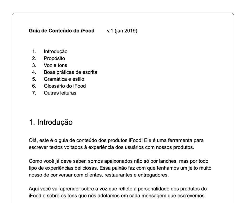
It was in January 2019 that the first version of the Content Guide for iFood Products reached the world. At the time, there were only 2 content designers on the team, me and Dante Felgueiras, and it took us about 1 month and a half to create the material. It was created in a simple text document, on Google, which we shared with the design team to collect feedback.
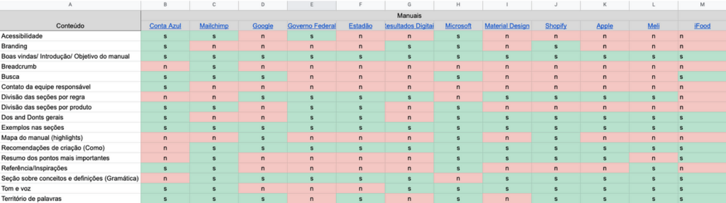
Many colleagues read the 29 pages of the document and included comments on topics they missed or guidelines that left questions. We made the necessary adjustments and started planning where to leave this information so that it could be consumed in a practical way by product designers and anyone else who needed to write to those who buy, sell or deliver via iFood.
From then on, the challenge was to make this document more visual and inviting to read. We didn't have the funds or time to dedicate to building a platform that could host the Guide, so we chose to leave it on Zeroheight, a tool for documenting design systems.
Zeroheight met some of our needs, but had limited visual capabilities. However, to save time, we decided that it would be our Guide's home – at least until we found a more complete option.
From a new home, the Guide deserved a special and exclusive visual identity of its own. So, together with the Mariana Louro we created the (beautiful) illustrations that would open each of the chapters.
Little by little, the look took shape (in addition to the illustrations, we were able to highlight examples and guidance on what to do and what not to do). In parallel, we started working on publicity, so that the content reached everyone on iFood who needed to communicate via text with our audiences.
Cut to 2021
We hit the nail on the head when creating the first version of the Guide, but we failed miserably in feeding the content with new UX Writing guidelines and findings. Therefore, the version we were using in 2021 was the same since 2019.
It was then that in March of this year we decided to take up this project again and give it a huge makeover. The idea was to see what still made sense, what no longer made sense and what needed to be incorporated. Furthermore, we wanted to have a Guide for each of our main tribes (the first version was unique and very generic, to cover all of the company's products).
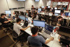
At this time, the Content Design team was very different from the beginning of 2019 – there were already 11 people taking care of the interface content. So, nothing fairer than having a Guide that reflects this evolution.
Hands-on – and in words
Planning is key when we think about projects that will be carried out by many hands; such as updating the Guide, which would involve the entire content team. Therefore, the Nathaly Bishop organized the agendas and held the first alignment meeting. On this day, we separated some references, defined the initial stages of the project and started to get our hands dirty.
The work was divided by tribes, and the content designers from each tribe worked together to review and create new content. The idea was that the original material was just a reference and that we could change, remove or include whatever was necessary.
They also gathered all the materials created in recent months, such as glossaries, content audits and writing manuals for specific flows, so that they were also available in the new version of the Guide.
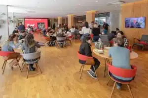
As the project was done while we were dealing with other design demands, the contents set aside 1 hour a week to discuss the tasks. It was a lot of work, which resulted in countless meetings, exchanges, laughter and moments of “my God, this isn’t going to work”.
Choosing the tool
With the revisions and creation of new sections progressing, we began to discuss another important point: where the new Guide would be located. Did it make sense to continue at Zeroheight?
While iFood's Design System was also hosted there, we felt it was the right choice. However, with the arrival of the Design Ops team, our Design System was entirely rebuilt in Figma.
So, we started thinking about possible alternatives for hosting the Guide, evaluating the positive and negative points of each one and considering our main needs:
- Autonomy to update our content without depending on the development team;
- Ease of use by teams of product designers and product managers;
- The possibility of inserting a search tool;
- The feasibility of sharing the material with any internal iFood team;
We even thought about keeping the Guide on Zeroheight, using WordPress or creating our own website. But, in the end, we came to the conclusion that Figma itself would be the ideal place to share our material, as we would have all the autonomy possible in a tool already well known by the design and product team.
Ah, but what about the search tool? After a conversation with the Design Ops team, we decided to develop a plugin that served this purpose (but that's a topic for another article!).
A little face for our Guide
With the chosen tool, in June, the Carol Maia presented the visual identity proposal for the new Guide. Based on a presentation template (from Power Point! ????), she adapted the format of the slides to suit our needs and componentized the elements so that the entire content team could add and edit the material with ease .
And so, the baby already had a face and was almost born.
Content Guide 2.0
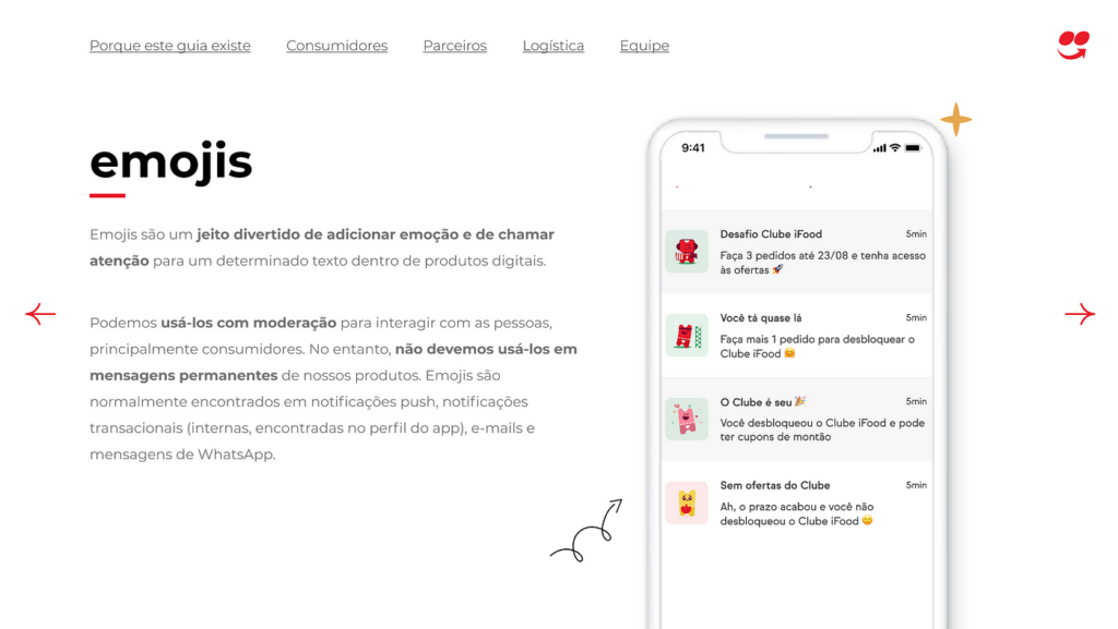
It took work, but in August version 2.0 of the Guide was ready; which, in addition to being more beautiful, is more complete and full of real examples of our products.
Teams can now consult writing guidelines and examples of use in specific flows within their tribe, searching for the topic they want to consult in the prototype's side menu.
We are also committed to disseminating this material, sharing it not only through the Design and Product channels, but throughout the company, explaining the importance of the guidelines contained therein and receiving many, many important feedbacks.
And did it end there? Of course! We will continue to feed the Guide with useful and updated content to help the daily lives of those who write for those who use iFood. We also want to work on the Spanish version with LATAM content designers Maria Mora It is Maria Rubiano, to ensure writing consistency on our Colombian products.
For now, the Guide is (still) for internal use and restricted to iFood teams, but in the future we want to share the document with the entire UX community.
Before finishing, I want to say a big thank you to the wonderful people who made and make this team happen: Ale Periard, Ana Lais, Beatriz Carneiro, Carol Maia, Jessica Nascimento, Malu Agostinho, Nathaly Bishop, Niala Pessuto, Rafaela Rodrigues, Simone Tobias It is Weila Mesquita ????????????
Do you want to be part of this team?
Discover the vacancies available in our Career Portal. Learn about the selection process and join the team!