Edmar Almeida
💻Craft Staff on iFood
Life on the planet only exists through the ability to create copies. With each copy, errors and needs meant that the first organisms evolved to the present day.
Each copy generates something new and there is, necessarily, nothing identical in the world. Every copy is unpublished, but this originality still derives from the copy.
That is not the subject of my article. I only introduced it this way to represent how art direction is created, the role of the creative and the way people evaluate creativity.
Nothing is really new: we are experts in remixing, recreating, transforming. If we see a photo and have inspiration, new paths emerge and in this creative process we can call something 'owner'.
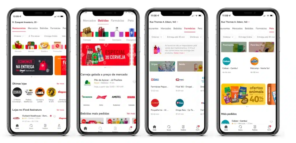
It was with the mission of bringing unity and ownership to the images of iFood categories that our journey began.
1 – Problems and opportunities
• Diversity of supply
On iFood, many categories appear all the time. With the opening of new business fronts in the app, using images with photographic processing from the bottom, as we have done since 2019, was no longer viable.
• Difficulty maintaining standards
In 2020, we moved to a model where the background became a component and the photo became a png over that background. Here, a new question arose: how to maintain the standard of light, shadow, scale and angle that we had in image banks? The answer was clear, we would not keep it.
Each image would have a different angle in this new format, which we used between 2020 and early 2022.
• Lack of representation
Another point of attention when using stock photos was not having such interesting attractions and resources to speak to the Brazilian public. Just look at the image of the Açaí category and you will realize that it did not represent the offers available in the app.
• Opportunity to increase brand presence
It has long been known that a brand is made up of a set of verbal, visual, sound, tactile and auditory ideas, and our desire was to bring more brand representation to the images. Where to place the iFood brand? How to create a highlight without making the journey tiring? These were some points that we studied before running the project.
2 – Thinking about the brand and the user
• Our project
When we observed the problems that the categories had, we also began to see the opportunities. So, we start from the following premises to create the scope of our project:
– Photos need to be similar to create a visual unity
– Photos can represent brand reinforcement
– Photos can facilitate the user’s journey in making their choice
And so, we started to sketch out what the new iFood photos would be.
• Concept art:
Little used for this type of work, concept art plays an important role in sales and first look and feel from the project. We designed some categories to explore composition, colors, branding, essentials and creative opportunities. Like the iFood mini flag in the Snacks category.
• Vision of the journey
We always think about storytelling when we design a user journey: spoken stories, but also visual ones, are the guiding lines that facilitate the person's journey through the app.
So that the photos could accompany the person on this journey, we saw the opportunity to bring angles to the same dish. Thus, the clicks would be at 0º, 45º and 90º.
Not all products are clearly visible from the same angle, and therefore the unit must not exceed readability. This way, if a product was illegible from one of the angles, this option would not be used.
3 – Errors and learnings in production
Photographers and culinarians are passionate professionals and it is not possible to achieve excellence in these areas without dedication and love. That's why we contacted the Mirona studio, based in Colombia, and the culinarians who make the dishes.
We did have a cultural challenge here. However, as the categories would be in the Colombian and Brazilian iFood app, it would be an opportunity to save on production. The iFood office in Colombia has a team dedicated to budgets and photographic productions, and this was of great help in making the project viable.
The clicks were made with icon logic in mind, and the similarity heuristic was an important point in this construction. If something took the focus away from the dish and could hinder recognition by the end consumer, it would be left aside.
If the rustic potato cut is larger and defines the potato better, that would be the cut chosen. If the thicker straw potato is easier to see in the photo, that would also be our option. Based on these assumptions, we conducted 5 days of photo shoots.
An interesting point is that we try to bring (whenever possible) a red dot in the photos to represent iFood. However, if this item or object distorted the dish, it was removed, to maintain the clarity of the composition.
4 – Post-production and its challenges
Our project had to be reworked several times. We had the challenge of combining categories from Brazil and Colombia to reduce costs and also to test several treatments for the same image – this step being essential for us to be able to exemplify the diversity of cuisines and orders that you can make on iFood.
Post-production relied on the talent of the team that made components and variations that can be used at any time by iFood product designers to create MVPs.
The end result
When browsing the app, you will occasionally see the iFood brand in our offers. But every time you will see the same photo treatment. This is what we call an owner.
Today, in our libraries and explorations we can use a huge range of components that will make the app more recognizable to the people who use it.
• iFood before and after photographic production